 |
| Anne Running the Boston Marathon - 30" x 24" Oil on Canvas. 2016. |
 |
| Example of the images sent |
 |
| Initial sketch |
 | ||
| I don't spend a lot of time trying to make a nice even tone to the canvas. I know I will paint over it later. |
 |
| Charcoal Drawing on Canvas |
After I send the initial sketch to the participant, I wait to see what his or her thoughts are. This time, I lucked out and Anne really liked it with no changes or alterations. Sometimes the person will want a different background or wonder why I changed it or just have questions.
 |
| Charcoal with Turpentine |
 |
| Starting to put in paint in the areas that I know will need several layers of paint. |
I then like to put an entire watercolor-ish thinned down layer of paint on everything just to establish a general sense of the color that will be there eventually. I know that I will do form painting later, but this is a good way of establishing a base. At any given time, there will be areas of the painting that are in the midst of thicker form painting (less painting medium and more paint) while other areas are still thinned down with oil paint and turpentine.
 |
| I usually just tape my reference picture right onto the canvas so I can see it. I know some painters who will work from the images right off of their computer screens. I like to tape the images really close so I don't have to look too far while painting. |
My palette consists of these standard colors and then I will add extra colors that are specific to the painting and cannot be mixed (like magenta, dioxazine purple or whatever if the painting needs that is unusual):
Zinc White or Soft Mixing White (I don't care for Titanium White and Flake white is toxic and really heavy)
Naples Yellow (Everyone questions that I use this and just don't mix it...we all have our quirks)
Yellow Ochre
Cadmium Yellow Pale
Cadmium Orange
Cadmium Red light
Cadmium Red Medium (Alizarin Crimson--sometimes)
Terra Rosa or Burnt Sienna
Cerulean Blue
Ultramarine Blue (Cobalt Blue sometimes)
Burnt Umber
Payne's Gray
Lamp Black (I use Ivory Black as well and sometimes Mars black)
I use Liquin as a painting medium. Again, many painters will question me about this practice because Liquin comes with Damar Varnish already mixed into it and Damar varnish will yellow after decades. This means I could mix my own painting medium or I could spend a lot more money on Maroger. However, I don't. At this point, Liquin is fine for me as are store bought heavy duty pre-stretched gallery wrapped canvases. Here is the rationale: when I was in college, I had no money so I could save money by buying and stretching my own canvas. As I got older and had children, I realized it wasn't money that was the main problem, it was time. As in I don't have any so what time I do have, I try to maximize it. I simply do not want to spend my time stretching and applying gesso to canvas if I only have two hours to paint at night after my kids go to bed. When I get a couple of hours to paint, I am ready to paint. Everyone has strong feelings about these topics: what kind of paint to use, what kind of canvas or linen to use, what kind of brushes to use, what palette of colors, etc. I used to be such a fussy painter as well and would only use Innerglow painting panels shipped to me from New York and I would only use Vasari paints, filberts, etc. Over time I have really mellowed out about all of these "rules". Honestly, I mix so many different brand of paints these days it is ridiculous. I do like to make sure I check the permanence rating on the labels, but I have lost my brand loyalty that used to be so important to me years ago.
 |
| I typically do not wait this long to get the background painted in. |
I typically have more than one of these portrait paintings happening at a time. I find that I like certain areas to dry before I continue, so I will usually jump over to a different painting and work on that one for awhile or work on a sketch, etc. Ideally, I have three of these paintings all going on at one time in some stage from initial prep to final form painting. That way there isn't a day that I can't work on something. If I am getting close to one of the paintings being finished, I will tend to send emails to a new participant asking if they have had time to get their photos taken, etc. If there is one thing I hate it is waiting which is ironic because living with NF is all about "wait and see".
I will send out multiple emails to different potential portrait candidates because not everyone has the time or family member available to be able to get photos quickly. Or they may just not be interested in the project and that is okay too. There are many people who have gone years and will send me a snapshot every once in awhile asking,"How about this?" It usually doesn't work. These paintings really need to be done from someone with a good camera who took good close up photos.
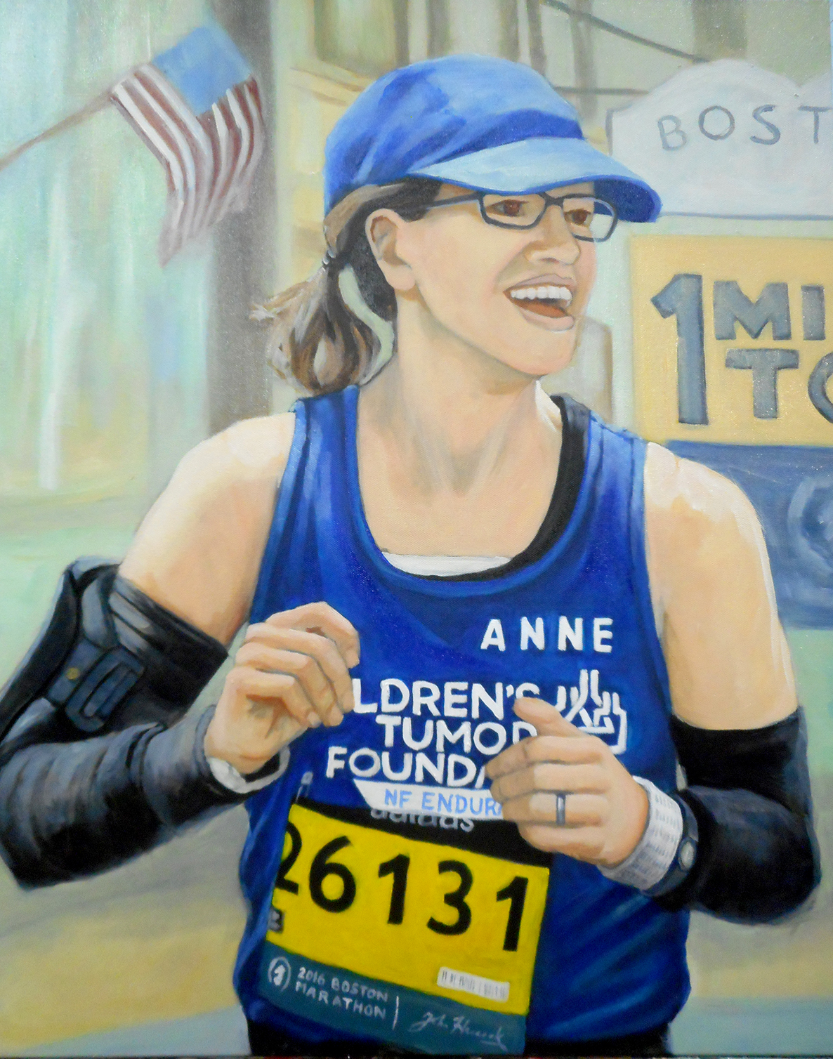 |
| I spent a long time redoing an impressionistic back drop and remembered all the American flags from other reference photos, so I added it at the last minute. |
During the time I am painting the subject is working on his or her biography. I will always display their biography next to the painting. There is not a lot of room on the placards, so I keep the biographies to about 300 words. This can prove to be difficult for people battling with NF as just one surgery or experience can take up that amount in a heartbeat, so they learn to edit or just consolidate all their surgeries into one paragraph. They typically include what life was like growing up with NF and any struggles they may have endured and what they are doing now to raise awareness. Each person is really different on what they want to share. Some people will not talk about any struggles and only talk about the positive impact they are doing today while others have no problem sharing stories about being bullied or a difficult operation. I think writing a biography is very personal, so I let them decide what should be shared and what they want to keep private.
My paintings are simply a way for me to introduce amazing individuals living with NF to a new demographic who, most likely, has not heard of the disorder. In that way, I am just making introductions using oil paint. If my painting is interesting enough, it is my hope the viewer will then read the biography and learn more about the person. If they are interested in the person, they might just want to learn more about Neurofibromatosis and perhaps go one step further and donate to the Children's Tumor Foundation or NF Network.
I have had people just ask why I don't take photographs or just have people send me pictures they've had taken and just use those? After all, there would be an immediacy and quickness to it and maybe even a farther reach. Besides the main issue of consistency of the image, I like the process of painting and talking via social media with these individuals while I paint their portraits. Sometimes depending on where they are from I find myself using Google Translate to try to correspond with them. There is a satisfaction for me in the idea that a collaboration can happen even when there isn't a common language between us.
Lastly, there is a fairly well established tradition of portrait painting and most people know that the paintings take time. They also know that portraits are meant to commemorate someone. It is just that with this project, I as the artist, decide whom to commemorate and that is so empowering. I enjoy getting to know each participant. I'm not looking for a quickie awareness campaign that is also forgotten within a month. I am fine with taking my time and painting a portrait that the person will enjoy and remember for quite some time. I am not in a rush. Oil painting is a slow process and I don't plan on going anywhere until a cure is found so I am not in any hurry to move onto something else. Slow and steady wins the race, and in this case, the Boston Marathon.